
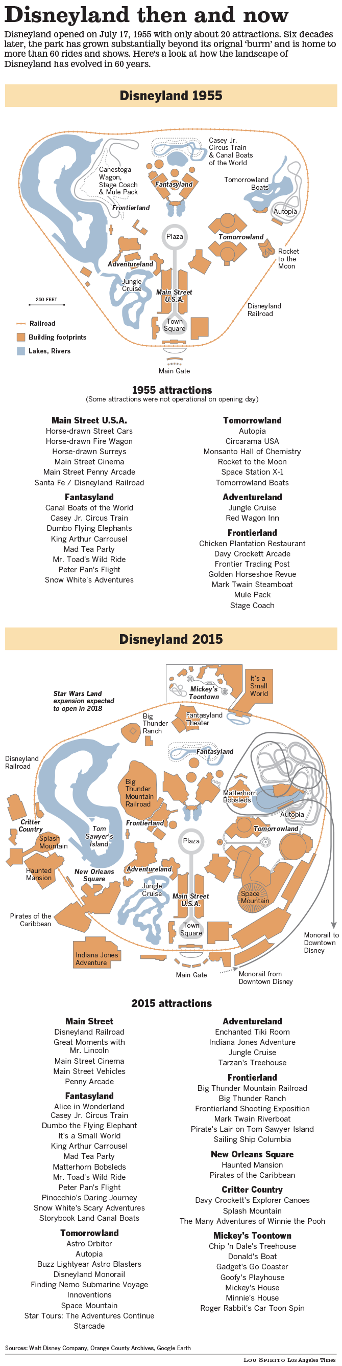
For the 60th Anniversary of Disneyland, editors at the Los Angeles Times requested a graphic that highlighted the growth of the amusement park over six decades. This simplified cartographic approach focused on two primary aspects to visualize the change over time — the railroad that circles the park and the 'show buildings' that house the primary rides, attractions and shops.
Note: This graphic has been reformatted and updated since originally published.
Note: This graphic has been reformatted and updated since originally published.
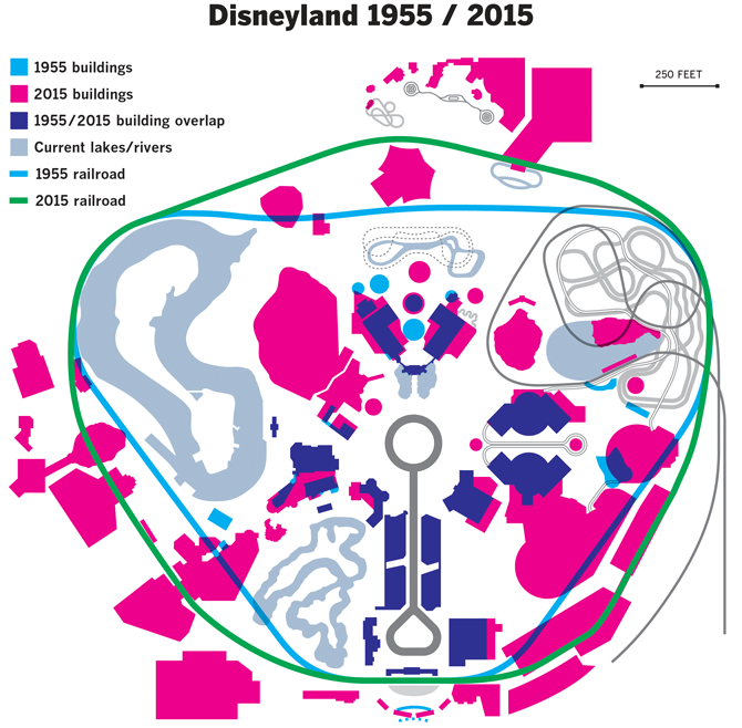
Just for this page — and a bit of fun — I created this simulated 'overprint' graphic to compare the 1955 buildings to those of 2015 in addition to the railroad that circumnavigates the park.
Software: Illustrator
© Copyright 2015 Los Angeles Times